Manual in PDF format
1. Basic information
1.1. Description of the control
Calendar is a classic calendar a la Outlook.
1.2. Create a new control
You can create a new calendar as follows from the edit form using the toolbar with controls:
- First, the position in which the new calendar is to be placed is determined by clicking the mouse in the edit form. This will highlight the selected position with a gray horizontal line. Then just click on the “Calendar” item in the toolbar of the edit form, fill in the attributes of the new control in the newly opened dialog, and then save. This will insert a new calendar in the pre-selected location of the edit form.
- If the required position is not determined before inserting a new calendar, the new calendar will be inserted at the end of the edit form.
1.3. Edit or delete a control
- For each existing control, a pencil icon appears on the left side of the edit form to change or delete the control's settings.
- Individual controls can be moved vertically in the edit form using the Drag&Drop method. Moving consists of grabbing the control, preferably behind its name located in the left column of the edit form, and then dragging it to the desired position in the edit form.
- For security reasons, it is important to have the function of moving controls enabled using the “Drag&Drop” check box located above the toolbar with controls. This field is unchecked each time you log in to the application.
2. List of tabs in the control settings dialog
- General – Setting general properties
- Text – Settings for columns displayed in the calendar
- Tooltip – Settings for columns displayed in details
- Help – Help text settings
- Rights – Rights settings
2.1. “General” tab
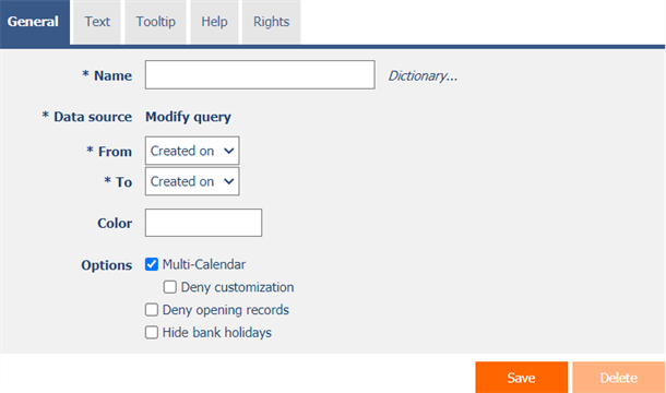
2.1.1. Name
- The name of the control displayed in the calendar header.
2.1.2. Dictionary…
- The dictionary lists the names of other controls, forms, view pages, categories, applications, and application groups used across the entire application.
- The dictionary search is used to design the correct control name and to maintain the consistency of the nomenclature throughout the application so that controls with the same meaning located in different places in the application are named in the same way.
2.1.3. Data source
- The data source defines the source database records displayed in the calendar.
- Data source settings are made in the graphical designer of database queries. A detailed description of the database query designer is provided in the separate “Database Query Designer” guide.
2.1.4. From
- Select a column that specifies the start date of the calendar event.
2.1.5. To
- Select a column that specifies the end date of the calendar event.
2.1.6. Color
- The default color for all calendar events.
- Each event can have its own color set. In the data source settings, the “Color by” column must be set, according to which the color of the event is determined.
2.1.7. Options
- Multi-Calendar
- Checking this box determines whether the calendar should allow events from other calendars located on the view pages of the same application to be displayed.
- Deny customization
- Checking this box determines whether individual users should be prevented from changing the selection of displayed calendars.
- Deny opening records
- Checking this box determines whether all users should be denied access to the edit form in order to open the displayed database record by clicking on an event in the calendar.
- Hide bank holidays
- Checking this box determines whether public calendar events retrieved from the “Settings” application should be hidden in the calendar.
2.2. “Text” tab
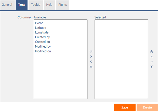
2.2.1. Columns
- Definition of the columns displayed in the calendar event text box.
2.3. “Tooltip” tab
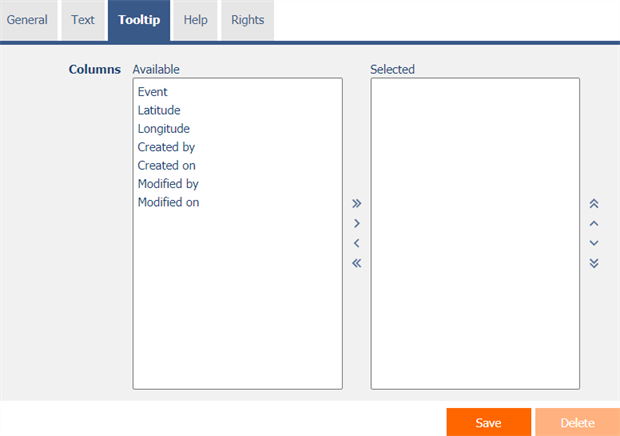
2.3.1. Columns
- Definition of the columns of details displayed when hovering the mouse over a calendar event.
2.4. “Help” tab
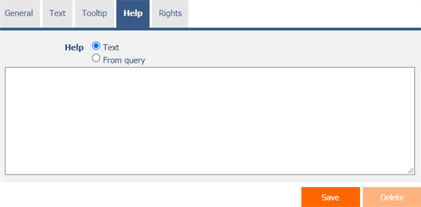
2.4.1. Help
- Help is the text displayed in the tooltip after clicking on the question mark icon, which is located in the calendar header.
- Help text supports simple text formatting using wiki syntax:
- '''Bold text'''
- ''Italics''
- '''''Bold italics'''''
- ""Text enclosed in double quotes""
- Lists:
- * Heading 1
- ** Subheading 1.1
- ** Subheading 1.2
- * Heading 2
- * Heading 3
- # Numbered heading 1
- ## Numbered subheading 1.1
- ## Numbered subheading 1.2
- # Numbered heading 2
- # Numbered heading 3
- The help radio button contains the following two types of help definitions:
- Text – help text defines a manually entered text string located in a multi-line text field below the radio button
- From query – the help text defines the result of a database query, which is evaluated when opening the edit form
2.5. “Rights” tab
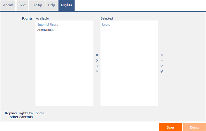
2.5.1. Rights
- Rights define a list of user groups and users who have permission to view the control on the edit form.
2.5.2. Replace rights to other controls
- The “Replace rights to other controls” function is used to unify the rights within the entire edit form for controls that are related in terms of rights.
- Thanks to the “Show…” link, it is possible to display a list of all controls in the edit form, including setting the rights of these controls. For each control, a check box is displayed that allows you to select the control. When you save a control, the same rights are then set for those selected controls.
- An alternative for unifying rights within the entire edit form is to display the report available from the “Subordinate object rights” tab in the edit form settings.
