Manual in PDF format
1. Basic information
1.1. Description of the control
Map is a map based on OpenStreetMap map data.
1.2. Create a new control
A new map can be created as follows from the view page using the toolbar with controls:
- First, clicking on the view page determines the position where the new map should be placed. This will highlight the selected position with a gray horizontal line. Then just click on the “Map” item in the toolbar of the view page, fill in the attributes of the new control in the newly opened dialog, and then save. This will insert a new map at a pre-selected location on the view page.
- If the desired position is not determined before inserting a new map, the new map will be inserted at the end of the view page.
1.3. Edit or delete a control
- For each existing control, a pencil icon appears to the left of the control page to change or delete the control's settings.
- Individual controls can be moved vertically on the view page using the Drag&Drop method. Moving consists of grabbing the control, preferably behind its name, and then dragging it to the desired location on the view page.
- For security reasons, it is important to have the function of moving controls enabled using the “Drag&Drop” check box located above the toolbar with controls. This field is unchecked each time you log in to the application.
2. List of tabs in the control settings dialog
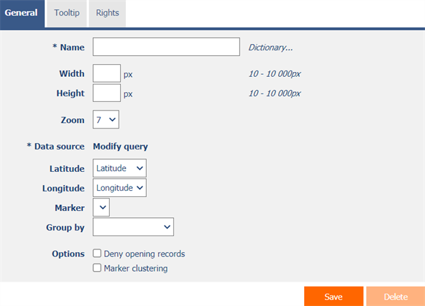
- General – Setting general properties
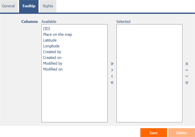
- Tooltip – Settings for columns displayed in details
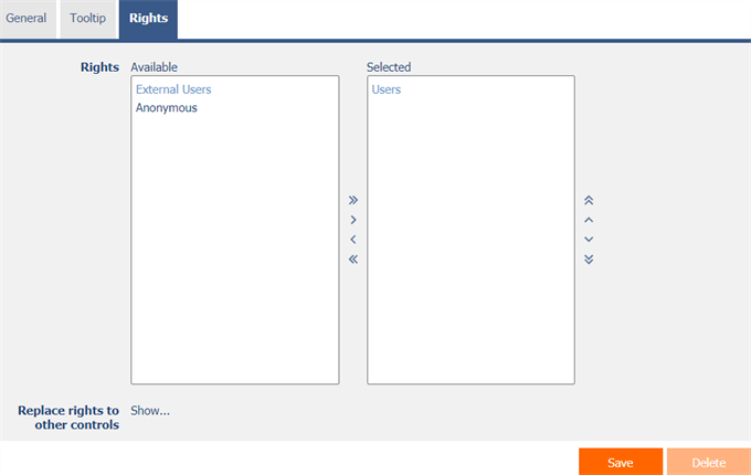
- Rights – Rights settings
- Administration – Setting other properties
2.1. “General” tab

2.1.1. Name
- The name of the control.
2.1.2. Dictionary…
- The dictionary lists the names of other controls, forms, view pages, categories, applications, and application groups used across the entire application.
- The dictionary search is used to design the correct control name and to maintain the consistency of the nomenclature throughout the application so that controls with the same meaning located in different places in the application are named in the same way.
2.1.3. Width
- The width of the control, expressed in pixels.
- If you do not fill in this input field, the width of the map will be set to the maximum width of the screen.
2.1.4. Height
- The height of the control, expressed in pixels.
- If you do not fill in this input field, the height of the map will be set to 590 pixels.
2.1.5. Zoom
- Default map zoom.
- The drop-down list contains values ranging from 0 to 18, the usual default zoom is 7.
2.1.6. Data source
- The data source defines the source database records displayed in the map.
- Data source settings are made in the graphical designer of database queries. A detailed description of the database query designer is provided in the separate “Database Query Designer” guide.
2.1.7. Latitude
- Select a column that specifies the latitude of the location on the map.
2.1.8. Longitude
- Select a column that specifies the elevation of the place on the map.
2.1.9. Marker
- Select a column that identifies the location icon on the map.
2.1.10. Group by
- Select a column that determines the grouping of individual places on the map into polygons.
- A map that does not use grouping displays database records as icons on the map.
- A map that uses grouping shows database records as vertices of individual polygons.
2.1.11. Options
- Deny opening records
- Checking this box determines whether all users should be denied access to the edit form in order to open the displayed database record by clicking on a location on the map.
- Marker clustering
- Checking this box determines whether places on the map should be grouped together at a closer zoom into markers with the number of places on the map that the marker clusters.
2.2. “Tooltip” tab

2.2.1. Columns
- Definition of the columns of details displayed when hovering the mouse over a place on the map.
2.3. “Rights” tab

2.3.1. Rights
- Rights define a list of user groups and users who have permission to display the control on the view page.
2.3.2. Replace rights to other controls
- The “Replace rights to other controls” feature is used to unify rights across the entire view page for controls that are related in terms of rights.
- Thanks to the “Show…” link, it is possible to display a list of all controls on the view page, including the setting of the rights of these controls. For each control, a check box is displayed that allows you to select the control. When you save a control, the same rights are then set for those selected controls.
- An alternative for unifying rights within the entire view page is to display the report available from the “Subordinate object rights” tab in the view page settings.
2.4. “Administration” tab

- The “Administration” tab is only displayed for existing controls.
2.4.1. Location
- Select the view page on which the control is located.
- The drop-down list contains all view pages located in the same application.
