Manual in PDF format
1. Basic information
1.1. Description of the control
Button is a button that serves to call javascript functions in a web browser, server-side scripts, printing database records to printing templates, redirecting the user to a specific edit form or to a specific view page.
1.2. Create a new control
A new button can be created as follows from the edit form using the toolbar with controls:
- First, clicking the mouse in the edit form determines the position where the new button should be placed. This will highlight the selected position with a gray horizontal line. Then just click on the “Button” item in the toolbar of the edit form, fill in the attributes of the new control in the newly opened dialog, and then save. This will insert a new button in the pre-selected location of the edit form.
- If the desired position is not determined before inserting a new button, the new button will be inserted at the end of the edit form.
1.3. Edit or delete a control
- For each existing control, a pencil icon appears on the left side of the edit form to change or delete the control's settings.
- Individual controls can be moved vertically in the edit form using the Drag&Drop method. Moving consists of grabbing the control, preferably after its name located in the left column of the edit form, and then dragging it to the desired place in the edit form.
- For security reasons, it is important to have the function of moving controls enabled using the “Drag&Drop” check box located above the toolbar with controls. This field is unchecked each time you log in to the application.
2. List of tabs in the control settings dialog
- General – Setting general properties
- Event – Event settings
- Help – Help text settings
- Rights – Rights settings
- Administration – Setting other properties
2.1. “General” tab
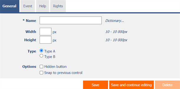
2.1.1. Name
- The name of the control displayed in the edit form inside the button.
2.1.2. Dictionary
- The dictionary lists the names of other controls, forms, view pages, categories, applications, and application groups used across the entire application.
- The dictionary search is used to design the correct control name and to maintain the consistency of the nomenclature throughout the application so that controls with the same meaning located in different places in the application are named in the same way.
2.1.3. Width
- The width of the control, expressed in pixels.
- If you do not fill in this input field, the width of the button will be determined automatically by the web browser.
2.1.4. Height
- The height of the control, expressed in pixels.
- If this input field is not filled in, the height of the button will be determined automatically by the web browser.
2.1.5. Type
- The type determines the appearance and meaning of the button.
- Type A – a more prominent button used for events with a larger meaning
- Type B – a less prominent button used for less important events
2.1.6. Options
- Hidden button
- The hidden button setting determines whether the button should be part of the edit form, but should not be visible in user mode.
- The hidden button can be found in the source code of the website, and it is also possible to programmatically click on it using javascript (for example, using the javascript function “bt_Click”).
- The hidden button cannot be used as part of security measures, the rights to the control are used for this.
- Snap to previous control
- Checking this box determines whether the button in the edit form should be displayed to the right of the previous one, or it will be displayed in the usual way below the previous control.
- If the previous control is also a button, the buttons are automatically snapped behind each other.
2.2. “Event” tab

2.2.1. Client
- The “Client” input field specifies a list of javascript commands that are executed when the button is pressed. The drop-down list offers the following frequently used javascript functions:
- Do you really want to? – return confirm('Do you really want to...?');
- AJAX… – return bt_Eval(this, 'ngef.aspx?test', 'evalFunction');
2.2.2. Server
- The server specifies the type of command to execute when the server-side button is pressed.
2.2.3. Options
- 1. Save the record
- Checking this box determines whether the currently open record in the edit form should be saved after pressing the button in the first step on the server side.
- If the record is not saved successfully, it means to end the execution of the event of this button, return to the edit form and display the error message to the user.
- 2. Run the script
- Checking this box determines whether the server script defined in the graphical script designer should be run after pressing the button in the second step on the server side. A detailed description of the script designer is given in the separate “Script Designer” manual.
- 3. Save the record
- Checking this box determines whether the currently open record in the edit form should be saved after pressing the button in the third step on the server side.
(None)
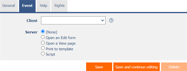
- The button is intended for calling javascript functions in a web browser only.
- A detailed description of javascript functions is given in a separate manual “Javascript functions”.
Open the edit form

- The button redirects the user to a specific edit form in order to create a new record in the database.
- In the target edit form, the value of the foreign key “pid” and “pform” will be set to the currently open record in the form with the button.
Open the preview page
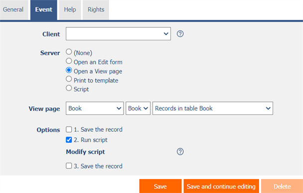
- The button redirects the user to a specific view page.
Print to template
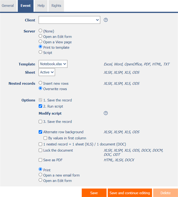
- The button starts printing to the selected print template stored in the “NETGenium\Templates” directory.
- A detailed description of using printing templates is provided in the separate “Administrator's Guide”.
- A detailed description of programming printing templates in “pdf” format is given in a separate manual “Programming printing templates in PDF format”.
2.2.4. Template
- Select a print template to use for printing from the edit form.
- The drop-down list offers a list of print templates stored in the “NETGenium\Templates” directory.
2.2.5. Sheet
- For printing to an XLSX, XLSM, XLS or ODS template only
- Select the sheet to which the printing will be performed from the edit form.
2.2.6. Nested records
- For printing to an XLSX, XLSM, XLS or ODS template only
- Insert new rows – NET Genium recognizes the occurrence of identifiers of nested records, and ensures automatic insertion of the values of individual nested records below each other in new rows
- Overwrite rows – NET Genium recognizes the occurrence of nested record identifiers, and ensures automatic insertion of the values of individual nested records below each other into existing rows
2.2.7. Options
- Alternate row background
- For printing to an XLSX, XLSM, XLS or ODS template only
- Checking this box determines whether the individual lines of the printed records should be highlighted alternately in gray and white.
- By values in first column
- For printing to an XLSX, XLSM, XLS or ODS template only and “Swap Line Colors”
- Checking this box determines whether the color tint should be identical for rows that have the same value in the first column.
- 1 nested record = 1 sheet (XLS) / 1 document (DOC)
- For printing to an XLS or XLSX template only
- Checking this box determines how nested records are printed so that each nested record is on a separate sheet.
- Lock the document
- For printing to an XLSX, XLSM, XLS, ODS, DOCX, DOCM, DOC or ODT template only
- Checking this box determines whether the printed document should be password protected.
- The global password for locking documents can be changed using the external function “NETGenium.ExcelPassword”. A detailed description of external functions is given in the separate manual “External functions”.
- Save as PDF
- For printing to HTML, XLSX or DOCX template only
- Checking this box determines whether the printed document is saved in PDF format.
- Print
- Checking this box determines whether the printed document should be offered for download from the currently open edit form.
- Open a new e-mail form
- Checking this box determines whether the user should be redirected to a form for entering a new e-mail message, in which the printed document will be automatically attached as an e-mail attachment.
- Open an Edit form
- Checking this box determines whether the user should be redirected to a specific edit form, in which the printed document will be automatically attached as an attachment to the first “File” control.
Script
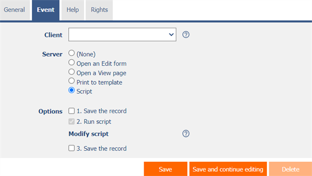
- The button is used to call javascript functions in a web browser, and then to run a server-side server script.
- A detailed description of javascript functions is given in a separate manual “Javascript functions”.
- A detailed description of the script designer is given in the separate “Script Designer” manual.
2.3. “Help” tab
2.3.1. Help
- Help is the text displayed to the right of the control itself in the edit form. The help of all controls starts on the same vertical line in the entire edit form – they are optically placed in a separate help column.
- The display of help text differs when snapping controls.
- If “Automatically group help for snapped controls” is checked in the edit form settings, a bulleted list of all help controls located in the same row will be automatically generated in the help column, with the option to click the bulleted list item and display the help text.
- If “Automatically group snap-in help help” is not checked in the edit form settings, the help for controls to the left of snapped controls is not displayed.
- Help text supports simple text formatting using wiki syntax:
- '''Bold text'''
- ''Italics''
- '''''Bold italics'''''
- ""Text enclosed in double quotes""
- Lists:
- * Heading 1
- ** Subheading 1.1
- ** Subheading 1.2
- * Heading 2
- * Heading 3
- # Numbered heading 1
- ## Numbered subheading 1.1
- ## Numbered subheading 1.2
- # Numbered heading 2
- # Numbered heading 3
- The text of the help can be displayed only after clicking on the icon with a question mark, which is located in a common place as help, only visually it takes up less space. Alternatively, abbreviated help text may appear in front of this icon. The question mark icon is defined by placing three dots at the end of the first line of help and then entering a new line (enter). The three dots may be preceded by an abbreviated help text. This is followed by help text of any length, including transitions to new lines.
- …
Help text displayed after clicking on the question mark icon - Short help text…
Help text displayed after clicking on the question mark icon
- …
- In conjunction with the question mark icon, a variant can be used in which, after clicking on the icon, the help text followed by three dots is not displayed, but on the contrary, the content of, for example, the wonder located anywhere in the edit form is displayed/hidden. On the new line after the three dots, it is necessary to specify the ID of this wonder using the javascript function “el”.
- …
el('D1') - Short help text…
el('D1')
- …
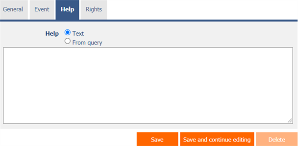
- The help radio button contains the following two types of help definitions:
- Text – help text defines a manually entered text string located in a multi-line text field below the radio button
- From query – the help text defines the result of a database query, which is evaluated when opening the edit form
2.4. “Rights” tab
2.4.1. Rights
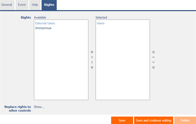
- Rights define a list of user groups and users who have permission to view the control on the edit form.
2.4.2. Replace rights to other controls
- The “Replace rights to other controls” function is used to unify the rights within the entire edit form for controls that are related in terms of rights.
- Thanks to the “Show…” link, it is possible to display a list of all controls in the edit form, including setting the rights of these controls. For each control, a check box is displayed that allows you to select the control. When you save a control, the same rights are then set for those selected controls.
- An alternative for unifying rights within the entire edit form is to display the report available from the “Subordinate object rights” tab in the edit form settings.
2.5. “Administration” tab

- The “Administration” tab is displayed for existing controls only.
2.5.1. Identifier
- The identifier determines the ID of the button in the edit form, which can be used to access the button using javascript.
2.5.2. Statistics
- Statistics display aggregated information about control usage across the entire application.
- Using the “Statistics” button, a detailed report of all places where the control is used or referenced is displayed, including the possibility to open the settings of such a place or control.
- Before each deletion of a control from the edit form, it is recommended to go through the statistics of the control thoroughly, and to eliminate possible misunderstandings.
- Before each deletion of the control from the edit form, the evaluation of the statistics starts automatically. If the control is used or referenced somewhere in the application, you must reaffirm the deletion of the control.
2.5.3. Copy
- Using the “Copy” button, it is possible to copy the button, including its script.
3. Examples
3.1. Javascript functions
- bt_Click();
- bt_Click(BT123);
- bt_Click('Save');
- return bt_Eval(this, 'ngef.aspx?test', 'evalFunction');
- var bt = bt_FindByText('Today', 2);
- var bt = el(BT123);
